Vue.js for data visualization

A while back I needed to add data charts on one of the pages on the project I’m working on, just a line chart with two data sets, nothing fancy.
Initially I was not sure how exactly I can manage to create and show the chart, but then I remembered this is Vue, everything (well almost) can be done with it.
What I ultimately decide to use for it: Apexcharts
Very useful JS library which get very well along with Vue and not only that there is a chart component that can be used in your view project:
npm install apexcharts --saveand the you can use globaly the appexchart component in your project like so:
<apexchart max-width="100" :options="chartOptions" :series="series"></apexchart>There were two things that I found a bit harder when I was setting it up:
Properly prepare the the data for the chart
Setting up the chart
Appexcharts have very comprehensive documentation but for me was overwhelming at first when I started, after a while it’s not so bad and you can easily get find your way around it.
Preparing the data
For the line chart I had in mind the data is called series which is basically an array with keys:
[
    {
        name: "Your key",
        data: [1, 2, 3, 4, 5],

    },
]
the difference in my case was that I needed to have 2 keys and data for each of them, which sounds easy at first but it was not.
And there reason it was not is that I have the data I need coming as a part of an object, but I need only 2 of the many fields that it have and also I needed to have and the date from this object to use it for the x axis.
What I needed is:
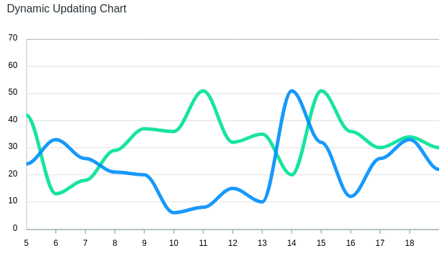
Courtesy apexcharts website
On the y axis I have the value of the keys and on the x axis I have the dates when those values are from.
So I needed to add some methods in order to prepare the data for the chart:
onMounted(() => {

    const historyData = [
        {
            name: "First Key",
            data: []
        },
        {
            name: "Second Key",
            data: []
        }
    ]

    props.data.history.forEach((record: object) => {
        historyData[0].data.push(record.first_key)
        historyData[1].data.push(record.second_key)
    })

    series.value = historyData

    const categories = []

    props.data.history.slice(0, 10).forEach((record: any) => {
        const date = DateTime.fromISO(record.created_at).toFormat('MMM d')
        categories.push(date)
    })

    chartOptions.value.xaxis.categories = categories
})
this away I can provide the right format data so it can be shown properly on the chart.
chartOptions.value.xaxis.categories = categoriesthis is not the recommended away of setting the chart options it’s just working for me in this particular case, the documentation provides the proper away
I know it’s not the best way, probably there are better ways of doing this, but this is the way that suits me best in the particular case.
Chart settings
There is a long list of settings that you can add to your chart and I mean a lot:
Colors
Font color
Font family
Shadow
Type
Width
Height
Zoom
And a whole lot more, and that’s the issue for me here there are too many things that you can change and it’s getting a bit crowded.
My man focus with the settings were the colors, because of the dark theme of the page on which the chart should go, the twist here is that there are a lot of components from the chart that have color such as:
X and Y axis
Legend
Tooltip
Grid
Fill color
And so many more…
All of the needed to be taken into consideration for the chart.
When trying to achieve something like that all the settings you need to look for and to make it look right and all of a sudden the process starts to became hectic, but in the end of the day the important thing is to get it right and done, this is all that matters.
I was able to do it and it looks and works great!
Conclusion
Using Vue for data visualization is a great way to really see what the framework is capable of and combining it with a libraries like apexcharts is a great combo.
Share this post